OVERVIEW.
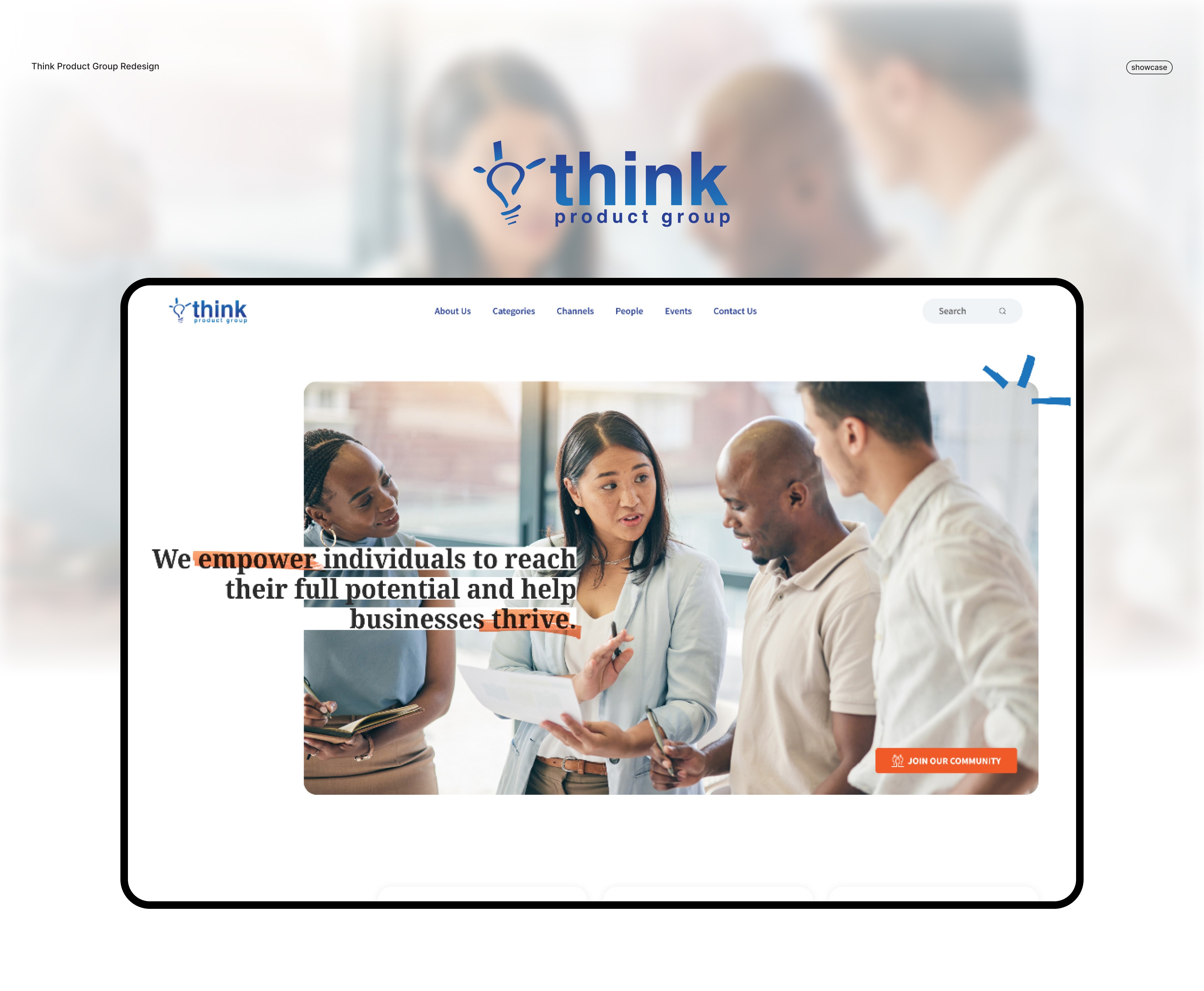
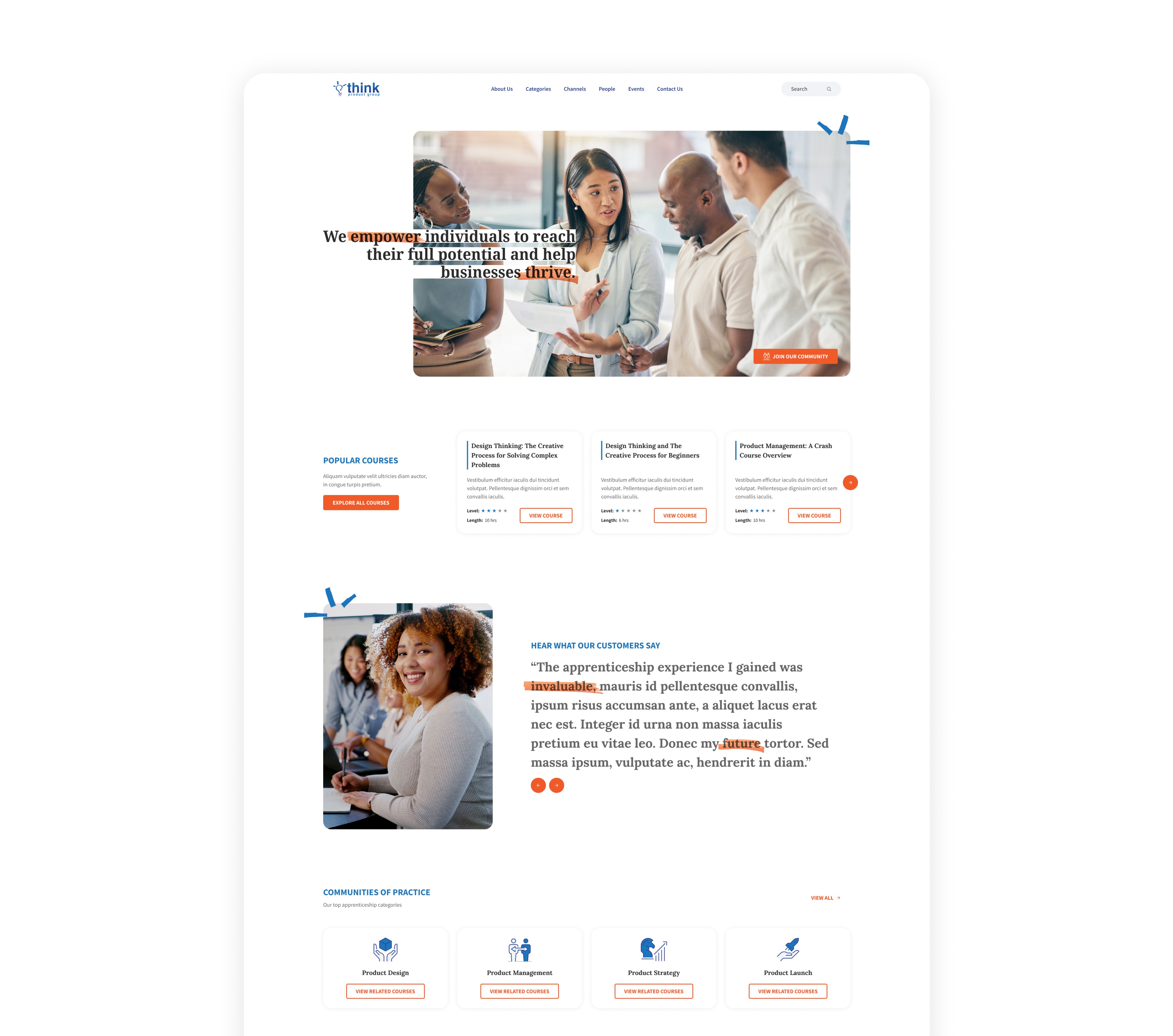
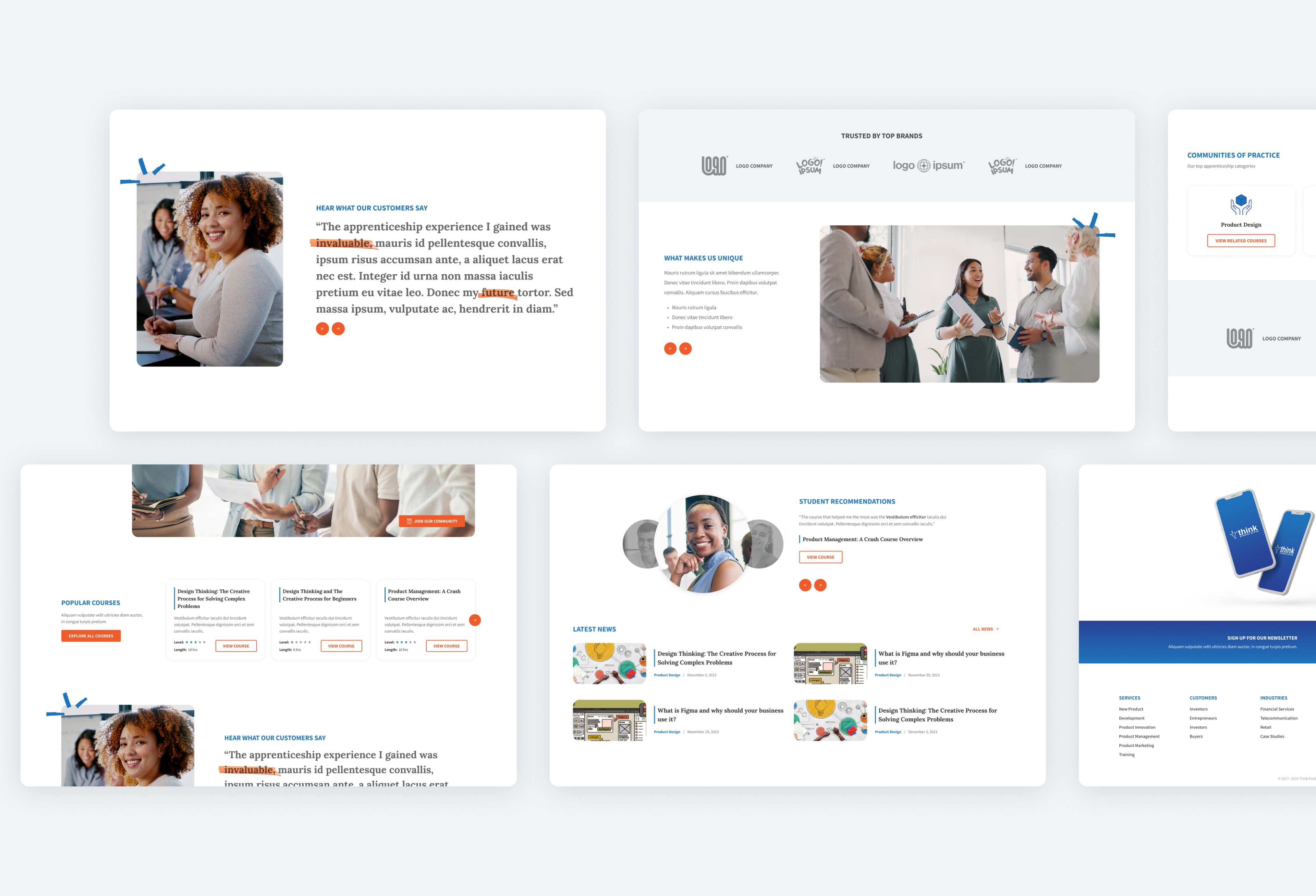
This landing page was designed to guide visitors through a clear, logical story. It starts with a straightforward value proposition in the hero section, supported by professional, collaborative imagery that reflects the focus on product design education. The primary CTA is visible and easy to find without overpowering the message. The goal at the top of the page is simple: explain what the platform offers and who it serves.
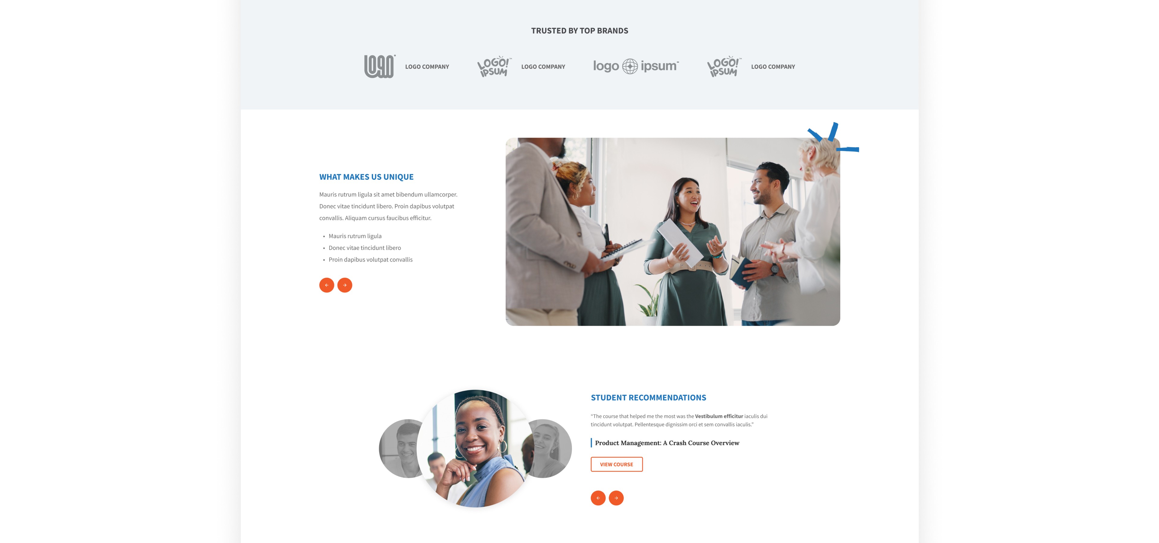
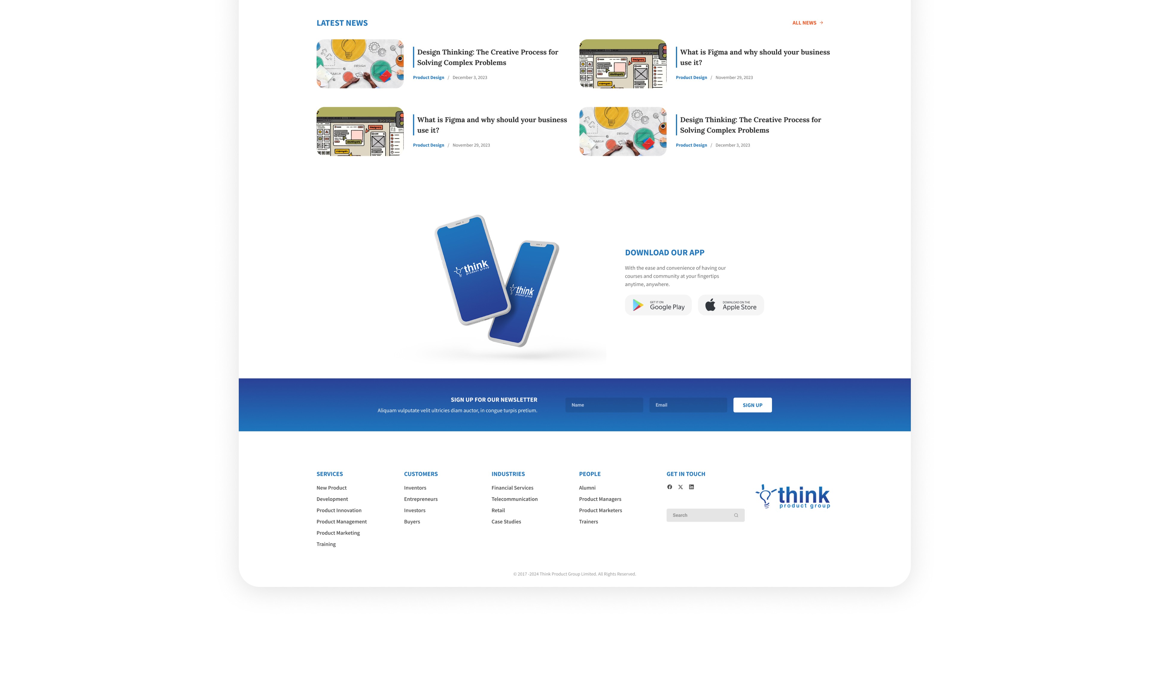
From there, the layout moves into course previews presented in structured cards. This makes it easy to scan titles, descriptions, and key details. Testimonials and brand logos follow to reinforce credibility at the point where a visitor may be deciding whether the platform feels trustworthy. The “Communities of Practice” section helps organize the content into clear categories, showing that the courses are part of a larger, well-defined learning structure.
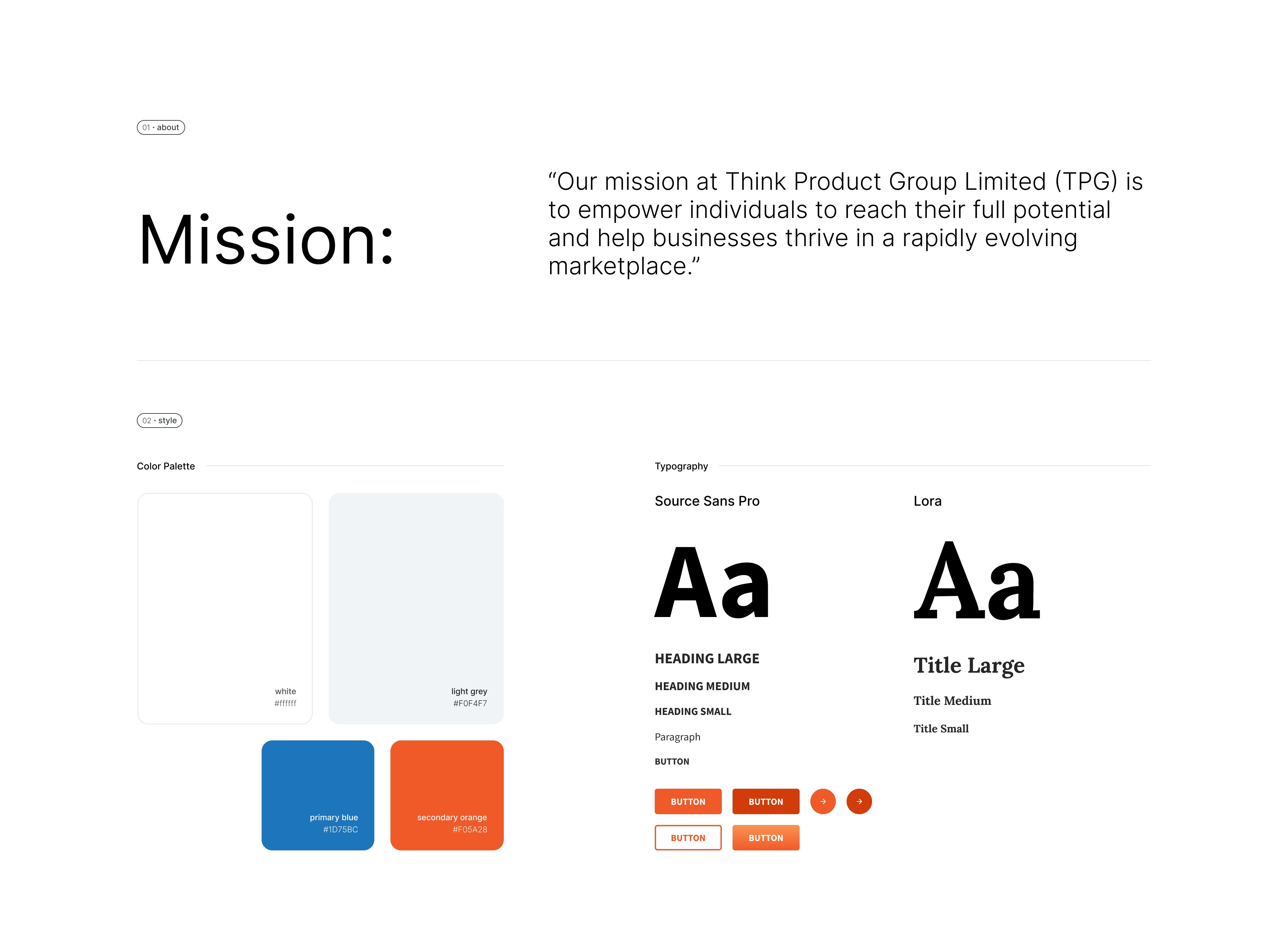
The design was built within an established brand system, including strict rules for CTA buttons and text links. Button height, padding, character limits, and hover states were predefined and consistently applied. Working within these constraints ensured visual consistency across sections and breakpoints. The result is a clean, structured landing page that communicates purpose, builds trust, and makes next steps clear without unnecessary complexity.