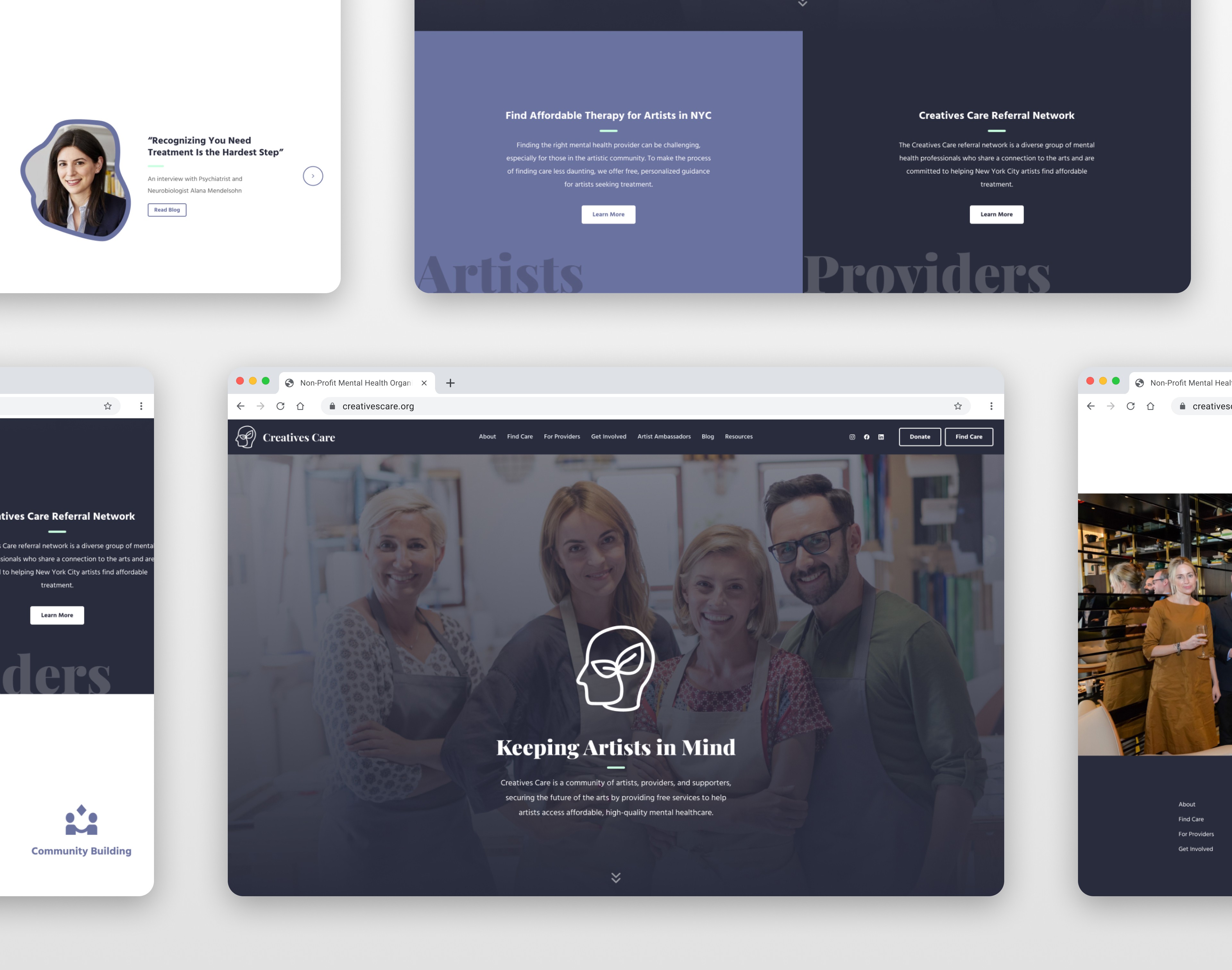
OVERVIEW.
This landing page communicates warmth, clarity, and purpose from the first screen. The hero section combines a soft overlay, approachable group photography, and a centered icon mark to establish trust and community. The headline, “Keeping Artists in Mind,” is direct and mission-focused, immediately clarifying who the organization serves. The subdued color palette—muted purples and soft neutrals—supports the mindfulness theme without feeling overly clinical or institutional.
The layout is intentionally simple and structured around clear audience paths. Early on, the page separates options for artists seeking therapy and providers interested in joining the referral network. This reduces friction by helping visitors quickly identify where they belong. The “How we help” section reinforces credibility with concise service pillars—personalized guidance, financial assistance, outreach, and community building—presented with minimal iconography and generous spacing. Each section builds logically without overwhelming the user with excessive content.
The overall design aligns well with a mindfulness-focused brand. Typography is calm and readable, buttons are understated rather than promotional, and imagery highlights real people instead of abstract concepts. Blog features and ambassador content add a human layer, showing voices behind the mission. The newsletter section and footer remain consistent in tone and color, maintaining cohesion through to the end of the page. The result is a clear, approachable landing experience that reflects empathy, community, and accessibility while keeping navigation straightforward.