OVERVIEW.
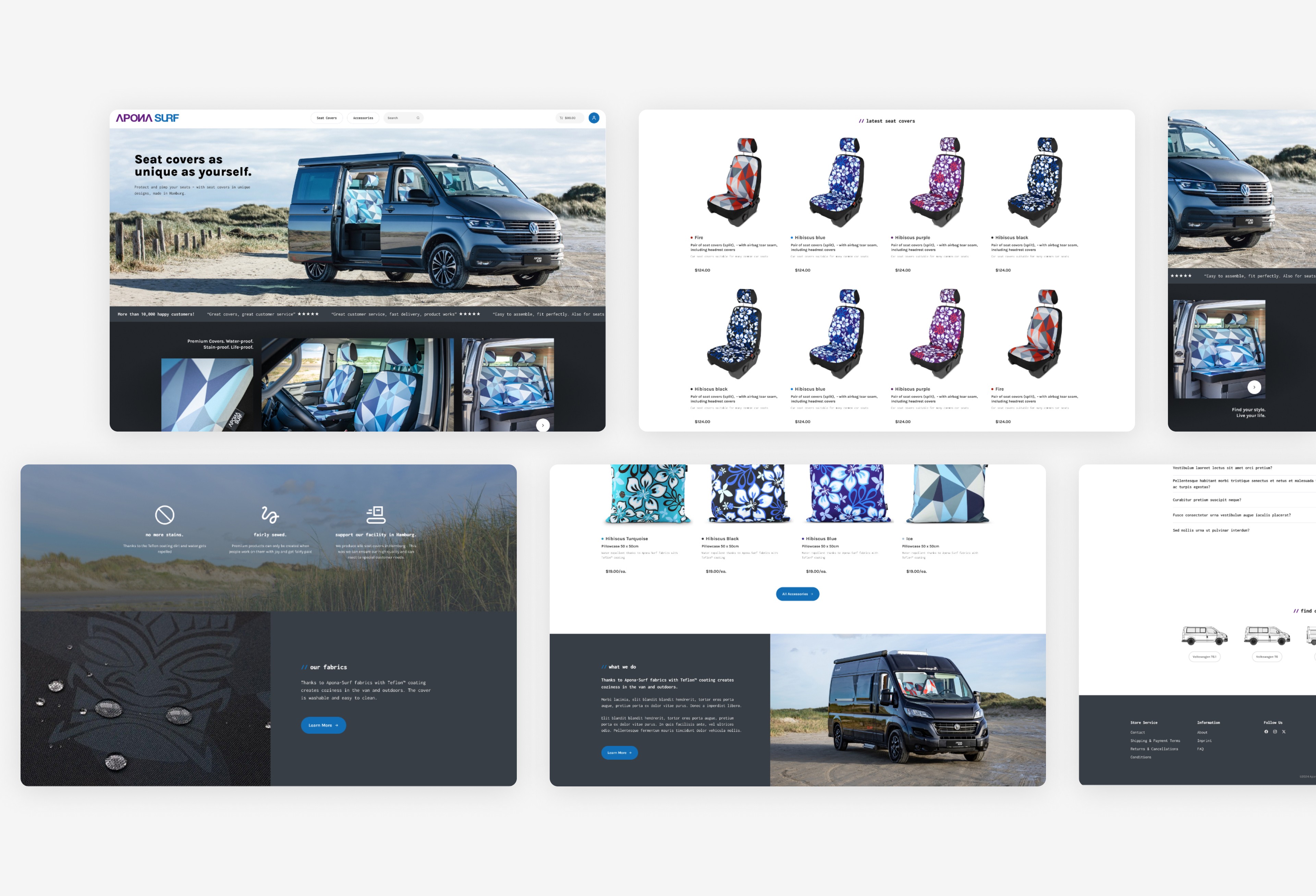
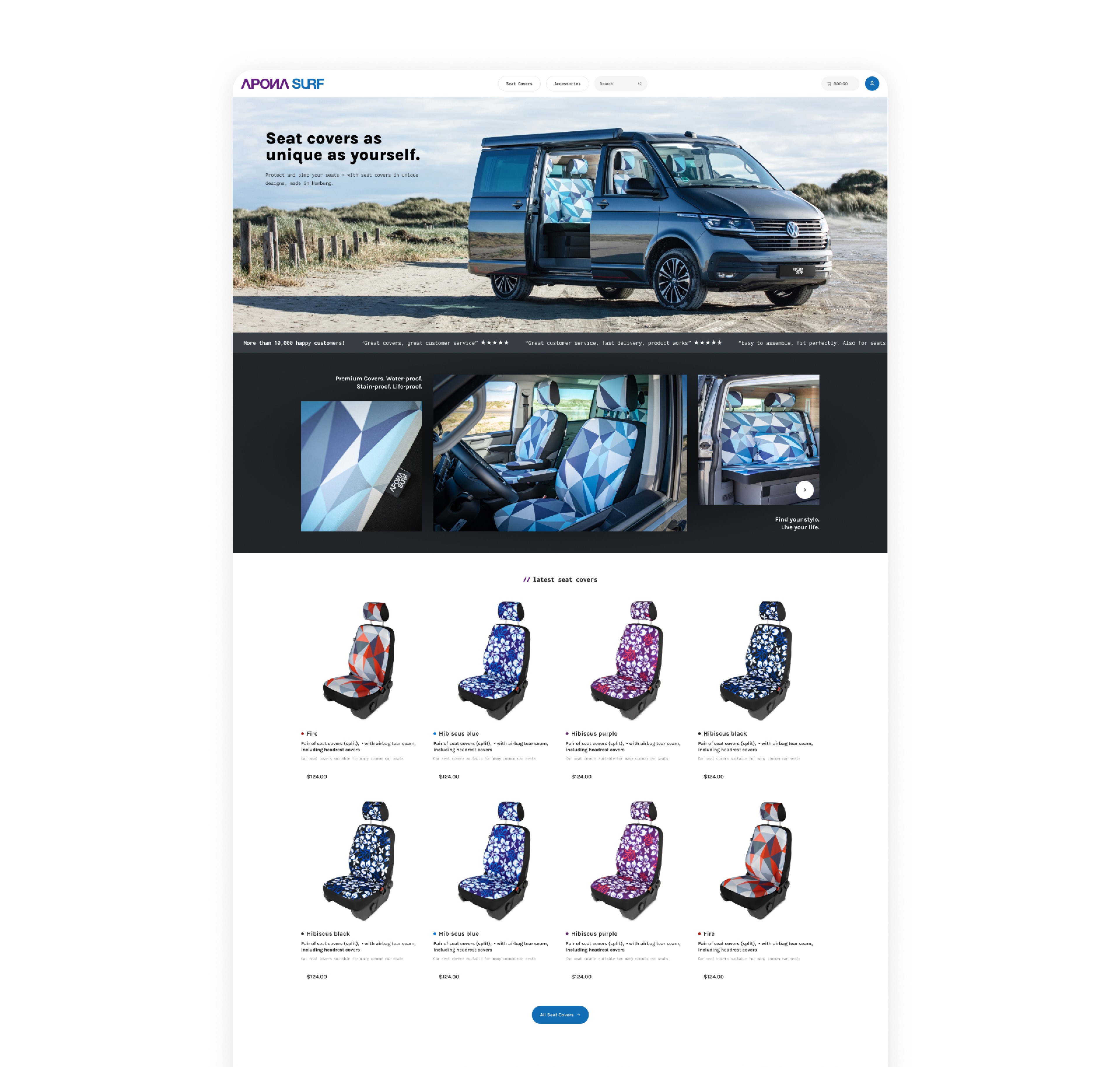
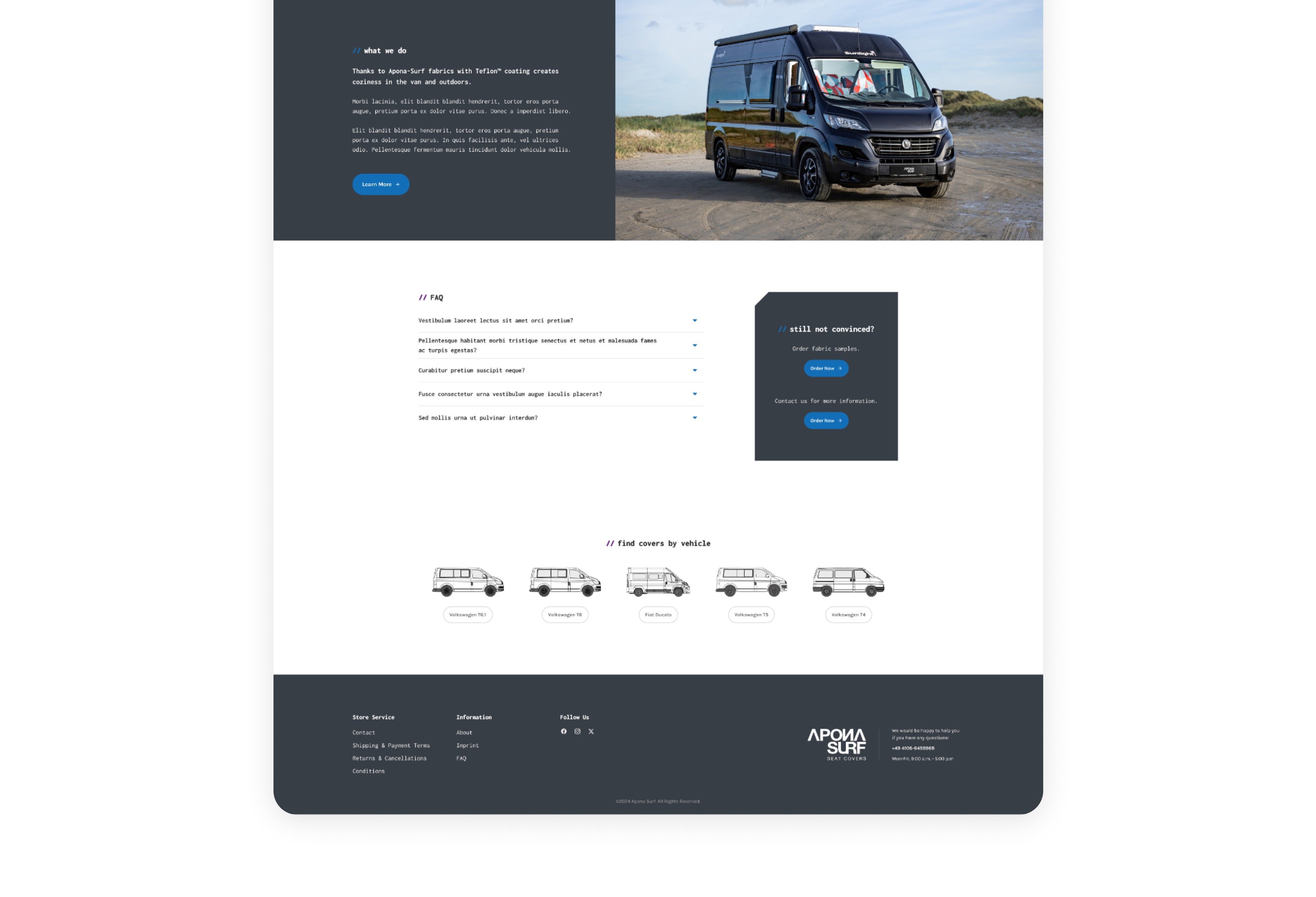
This homepage clearly communicates the brand’s focus on distinctive, durable seat covers. The hero section pairs a strong, simple headline with lifestyle imagery that reinforces both personality and practicality. The clean navigation and restrained typography keep attention on the product and patterns, which are the core differentiators.
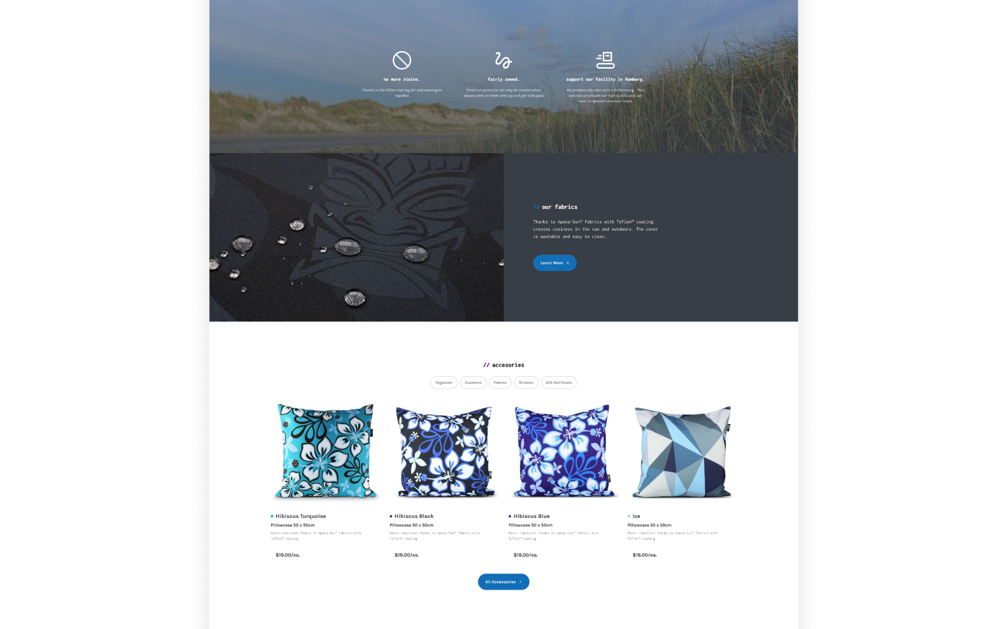
The layout moves quickly into product visibility, showing real-world installations followed by a structured product grid with clear pricing. The progression—from featured imagery to seat covers, fabrics, accessories, FAQs, and vehicle selection—supports a logical buying journey. It highlights style first, then answers practical questions about fit, materials, and compatibility.
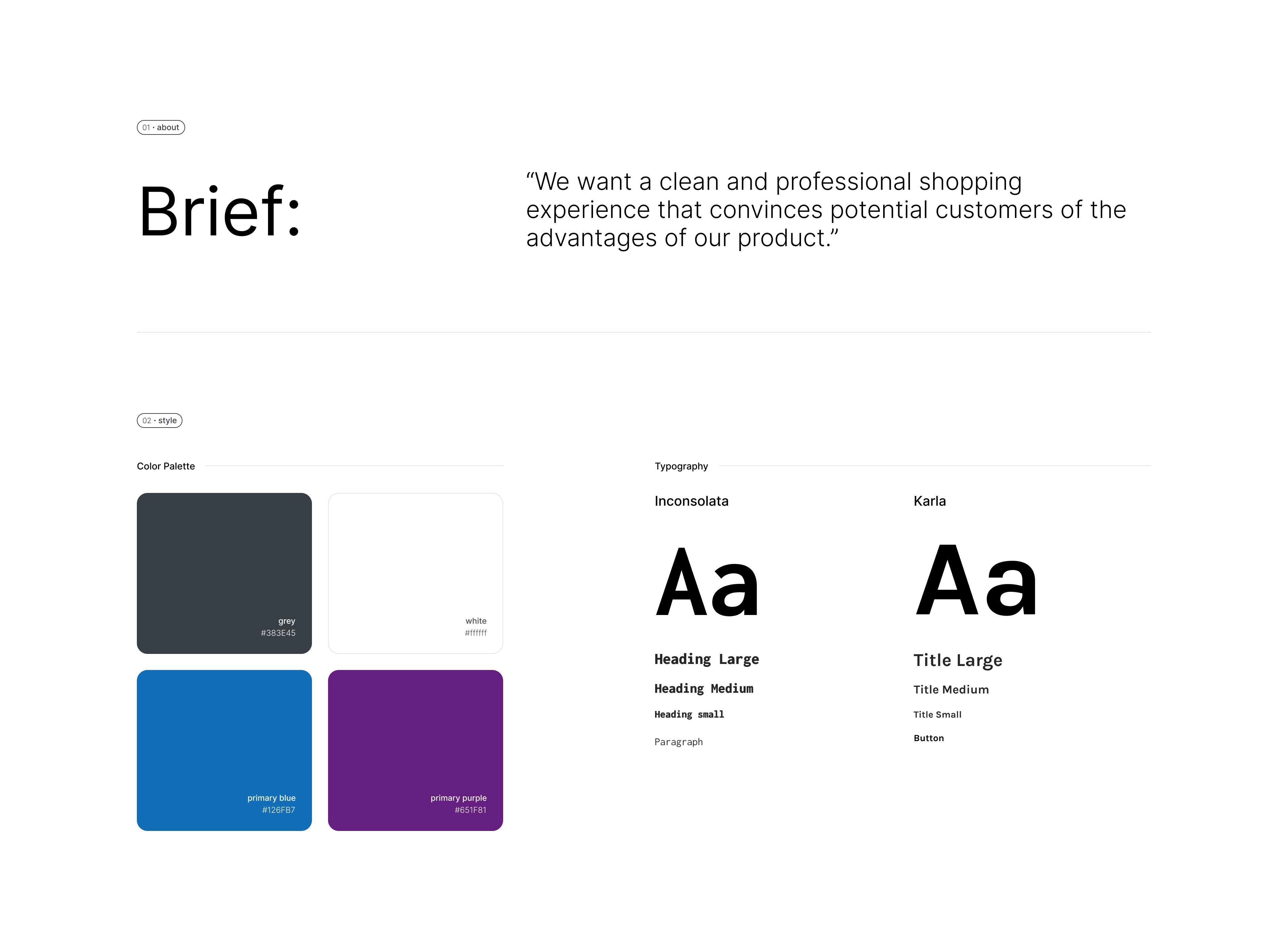
The design aligns closely with the client’s brand assets. Bold patterns are balanced with neutral backgrounds and dark blue tones from the brand palette. Buttons and links remain consistent in color, size, and placement, creating a cohesive system across the page. The result is a focused, product-forward e-commerce experience that feels consistent with the brand while remaining easy to navigate.