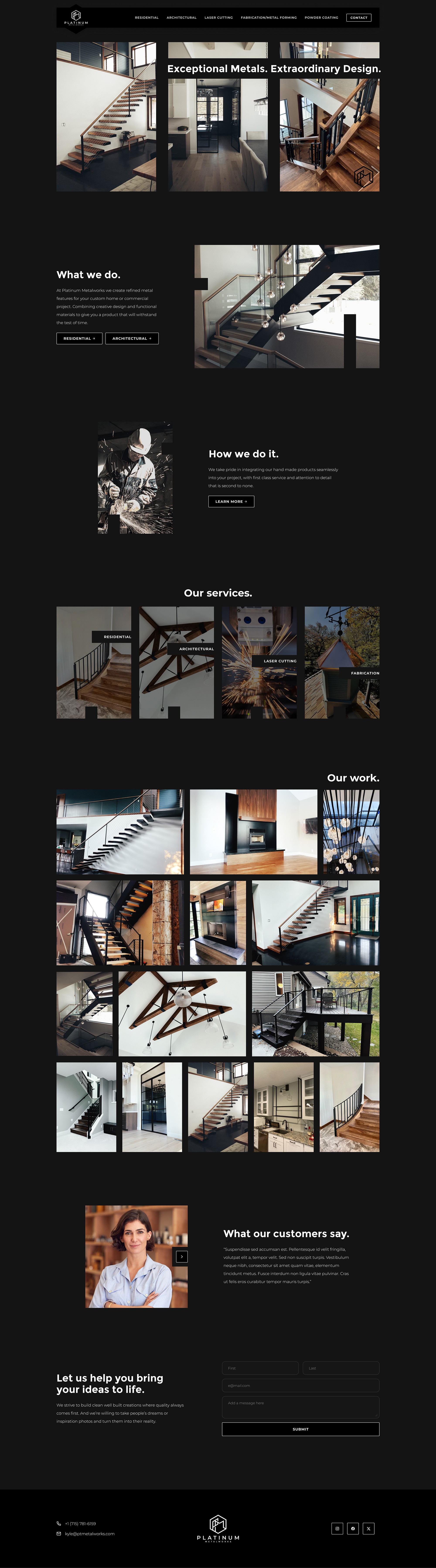
OVERVIEW.
This homepage is designed to reflect the strength and precision of the metal business it represents. The dark background, high-contrast typography, and bold photography immediately communicate craftsmanship and durability. The opening headline, “Exceptional Metals. Extraordinary Design.” sets a clear tone, while the large-scale project imagery reinforces quality without relying on excessive text. The visual weight of the layout mirrors the physical weight and permanence of the materials being showcased.
The structure of the page follows a clear progression: what the company does, how they do it, the services offered, and then proof of work. Each section is supported by strong, real project photography rather than stock-heavy content, which builds credibility. The “Our Services” section simplifies complex capabilities into clearly defined categories such as residential, architectural, laser cutting, and fabrication. This helps visitors quickly identify relevance. The project grid that follows functions as a visual portfolio, allowing the work to speak for itself through scale and variety.
The overall design stays consistent with the brand’s identity. The black and neutral palette feels industrial and refined, aligning with a high-end metal fabrication company. Buttons are minimal and understated, reinforcing professionalism rather than sales-driven messaging. Typography is clean and structured, supporting a modern architectural aesthetic. The result is a confident, portfolio-forward website that highlights craftsmanship, builds trust through real work, and maintains a cohesive brand presence throughout.